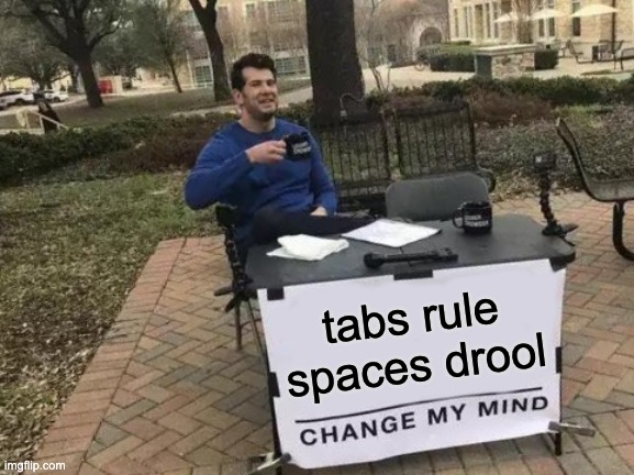
Tabs Vs. Spaces: It's an Accessibility Issue
Tags: #best practices
I don't remember where I got my preference for Tabs over Spaces, but I've been ride-or-die Tabs for as long as I can remember. I wasn't joking when I included that "tabs rule, spaces drool" meme in my "Sweat the Small Stuff" article. I run in Team Tabs and while I do try to have "strong opinions weakly held," I am skeptical that anyone would ever be able to change my mind.

This came up in the Aftershow discussion for my podcast many weeks ago, and my friend and co-host Ben Nadel described it as an "accessibility issue," which is just such a perfect description...
The argument goes like this: People are welcome to have their own opinions on how much indentation they would like to see. Perhaps you like 2-character-width indentation, or 8, or somewhere in-between. By using a literal space character for indentation, you are forcing your preference on others who read that code.
Now contrast that with tabs. 1 tab character is 1 level of indentation. If my preference is 2-character-width indentation, that's what I have set in my editor and I see space equivalent to 2 characters. And my teammate who prefers 6 or 8 characters can see it the way they want it.
Now, that's all fine, but here's where it becomes an accessibility issue.
People with less than perfect eyesight can have trouble differentiating indentation when the tab-width is low. For accessibility reasons, we need to be able to see more space. And the more code we're looking at, the more it's needed. Having to scroll down 14 lines of code and keep 6 levels of indentation aligned by eye is so much easier with a wider tab-width.
Nothing against those of you with fantastic vision —I used to be one of you— but when you can get your preference in a way that allows me to also be able to read and understand the code, that is objectively better than an alternative that only lets one of us get what we want or need.
Tabs are just better. It's an accessibility issue.
Addendum
Occasionally I find even more slam-dunk evidence that tabs is the only correct way to indent code, and I've decided that when I do I'm going to add it here.
Thanks to Rich Harris for pointing this one out:
The main reason I would like to see this change is for refreshable braille displays that are used by blind programmers a lot. Each space wastes one braille cell and takes away valuable braille realestate. So if the default indentation of a project is 4 spaces per level, a 3rd level indentation wastes 12 braaille cells before code starts. On a 40 cell display, which is the most commonly used with notebooks, this is more than a quarter of the available cells wasted with no information. If each indentation level was represented by only one tab character, there would be three cells occupied by a tab character each, and on the 4th cell, the code would start. That's less than 10 percent occupied on the same length display, but all cells contain valuable information that is easily discoverable and immediately comprehensible.
— MarcoZehe on GitHub in a PR requesting that prettier change their
useTabssetting from defaultfalseto defaulttrue.
